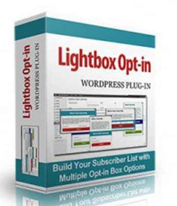
Lightbox Popup Opt-in Plugin
$4.95
Discover How To Stop Your Site Visitors From Slipping Away Without Subscribing!
You’ve only got one chance to grab their attention! How long have you been struggling to build a mailing list? A year? Two? More?
Sure, you’ve got the tantalizing offer, an opt-in form strategically placed in the upper right corner of your website, and maybe you’re even driving traffic to a squeeze page.
But is anyone actually seeing that stuff?Probably not. Ad Blindness – It’s Not Just For Google Anymore.
Here’s the thing. No one looks at the stuff in your sidebar.
Sure, if she’s a loyal reader and she’s got nothing better to do and she’s looking for more of your great blog posts to read…maybe. But she’s already on your mailing list anyway.
You want to capture the guy who just landed on your blog after following a random link on some other website. He won’t be able to find you again if he tries, so you need to entice him to subscribe right now.
And that subtle sidebar form isn’t going to cut it. This job calls for a popup.Ugh! I Hate Pop-Ups!
What if I told you that the only people who say that are those who have never seen for themselves how well they work?
It’s not just hype. Website owners use pop-ups because they…
- Grab a reader’s attention
- Provide important information they might not otherwise see
- And yes, increase opt-ins
| Product type | |
|---|---|
| License | |
| File Size (MB) | 0.93 |
Related products
WordPress PLR
WordPress PLR
WordPress PLR

WordPress PLR
WordPress PLR
WordPress PLR


