Graphic Design Masterclass
Only registered users can download this free product. Please Register HERE
Finally! A ‘Fun And Easy’ Way To Boost Your Product Image Without The NEED To Hire Graphic Designers! So You Too Can Catapult Your Subscriber Rate And Sales Conversions By As Much As 300{bf55a566eed96abb52251861a25517ef13382e5bd1f7484b88af8415f949c3b9}!
![Graphicdesig[1]](https://bunny-wp-pullzone-jjmanzn4b9.b-cdn.net/wp-content/uploads/2020/01/graphicdesig1.jpg)
In the Graphic Design Masterclass video series, you will learn how to design simple yet professional looking mini sites, and virtual covers using Adobe Photoshop, Macromedia, and GIMP (free tool) even if you aren’t good at art creation!
Video Series 1 : Adobe Photoshop For Newbies (8-Part Video Course)
Video #1: Understanding Adobe Photoshop Features You Will Use (9 minutes and 38 seconds)
Adobe Photoshop can be a complex tool only because you can do so much with it, however for in this video series, we’re going to keep it as simple as possible. In fact, in this video you’ll see an overview of the few tools and Adobe Photoshop features we will use. When you see this video, you’ll see how you can do so much with so few features, but you’ll learn how to use them in depth in the future videos.
Video #2: The Importance of Royalty Free Images and How to Find Them (7 minutes and 39 seconds)
When you create your own minisites, you’ll need to have access to professional photography to make your designs look great for whatever subject matter. Well, in this video, you’ll learn the importance of using Royalty free images and how you can find them to fulfill your needs.
Video #3: How to Use the Adobe Lasso and Crop Tool (7 minutes and 35 seconds)
The Adobe Photoshop lasso and crop tools are the tools that you’ll use to take people and objects out of regular pictures and put into your minisite designs. I’m sure you’ve seen headers with people or objects in them right? We’ll that’s where the lasso tool and crop tools come into play. So you’ll learn what they can do for you, but most importantly how to use them correctly.
Video #4: How to Work with Layers to Make Art Creation Easier (5 minutes and 40 seconds)
Layers are the big secret to making photos come to life. In Photoshop you can take several photos and merge them together to make it looks like it’s one picture. At the same time, layers will make your life as a minisite creator so much easier, you’ll save lots of time. In this video, you’ll learn how to use layers to your advantage.
Video #5: How to Understand the Art of Balancing Your Designs (7 minutes and 59 seconds)
Do you remember looking at a picture and saying to yourself, nice picture, it’s looks right. Or maybe you thought, “that picture doesn’t look right”. We’ll this is when balancing your designs comes into play. If you learn how to balance your headers, footers, ecovers, and more correctly you’ll learn how to make your minisites look right when people look at them.
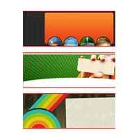
Video #6: How to Create a Minisite Header (11 minutes and 14 seconds)
Here’s the fun part. You were shown videos 1-5 for a reason, that is, to help you understand the basic fundamental concepts before you got started creating the actual designs. The best part, is that you can take videos 1-5 and apply them to other things besides just minisites! So with that said in this video, you’ll learn how to create a professional minisite header using the tools Adobe Photoshop and what you learned earlier.
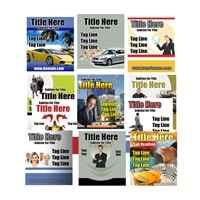
Video #7: How to Create a Minisite E-Book, DVD, E-cover (9 minutes and 47 seconds)
Just as it says, you’ll learn how to take the header you designed in the previous video and create an ebook or dvd ecover. You see, creating the header first allows you to understand how to easily transfer the designs to the ecover and balance it out.
Video Series 2 : Create Your Own eCover Graphics! (8-Part Video Series)
- Video #1: Getting Started Creating Your eCover From Scratch.
- Video #2: Creating The Front Image For Your eCover.
- Video #3: Creating The Front Of Your eCover Part II.
- Video #4: Creating The Side Graphics For Your eCover.
- Video #5: Making The Disc Image For Your eCover.
- Video #6: Making The eCover Box And Disc Image.
- Video #7: Making The eCover Box And Disc Image Part II
- Video #8: Using eCover Software And It’s Functions
Video Series 3 : How To Create Web 2.0 Graphics Using Gimp! (7-Part Video Course)
Video #1: How to Download and Install GIMP
GIMP stands for GNU Image Manipulation Program. It is a freely distributed piece of software that is like a scaled down version of Adobe Photoshop, yet of course it’s easy to use. You’ll be shown where to download GIMP and how to install it.
Video #2: Understanding GIMP’s Features and Tools
Just like any software, knowing and understanding the features you will be using in the future videos is a must, so you save time trying to figure them out later.
Video #3: How to Make A Web 2.0 Shiny Buttons Using GIMP
It’s the new trend of graphics, graphics that come to life. So, every wonder how people make those shiny buttons that come to life? We’ll you’ll learn just that in this video.
Video #4: How to Create Image Reflections and Shadows Using GIMP
Have you noticed how companies create ecovers and screenshots and they have cool reflections and shadows that make them look like you’re staring at the real thing? In this video, you’ll learn how easy it is to actually take any picture and create a reflection and shadow with this free tool, GIMP.
Video #5: How to Create a Shiny Badge Using GIMP
You’ve seen those shiny badges people use on their sales pages that announce special sales. Creating badges in GIMP is very straightforward. You’ll learn how to manipulate the shapes GIMP gives you to create a professional shiny looking badge so you can start adding them to your sales pages like the professionals.
Video #6: How to Create a Web 2.0 Text Logo with a Reflection Using GIMP
By now, you’ve probably realized that when people say Web 2.0 graphics, what they mean is new style or new look graphics are being given. Well, long long ago, text logos looked bland and normally were made up one purely one color, no gradients and no shiny look. In this video, you’ll learn how to give your text logos a cool shiny gradient look, as well as a reflection. This is something many designers create nowadays.
Video #7: How to Create a Cool Web 2.0 Striped Style Header Using GIMP
Don’t know how to draw and don’t have a sense of creativity? Don’t worry, we’ll take everything you’ve learned so far and create an eye catchy Web 2.0 header that has stripes. You can use these headers on the top of your sales pages, or even any other landing pages.
| Product type | |
|---|---|
| License | |
| File Size (MB) | 267.2 |
Related products
Facebook Covers PLR
Graphics Design PLR
Graphics Design PLR
eCover Templates PLR
Graphics Design PLR
eCover Templates PLR

 Funtastic Fonts


